
Led the redesign of Zoom’s global web ecosystem to support a shift to an AI-first platform, navigating evolving strategy, cross-functional complexity, and a 10-week launch timeline—less than half the standard delivery cycle.
August 2024 – January 2025
Led product design for Zoom’s global web platform, defining strategy, IA, and design direction. Partnered cross-functionally and led a team of designers across the experience.
Product strategy, UX design, information architecture, design leadership, experimentation strategy, and cross-functional execution at scale.
Since I joined in 2021, Zoom had evolved far beyond meetings, expanding into a full suite of communication and business tools. But the homepage still reflected an earlier version of the company.
Shaped by years of incremental updates, the experience had become fragmented and difficult to navigate. Users could access individual products, but lacked a clear understanding of how they connected—or why they mattered together.
The result was a homepage that no longer functioned as a coherent entry point into the platform.
Continuous additions without structural realignment led to a dense, hard-to-parse experience.
Users still primarily saw Zoom as a meetings product, with limited awareness of Zoom Workplace and its broader suite of tools.
The homepage failed to communicate a cohesive narrative about what Zoom is and why it matters.
We began with a clear, research-backed direction and a plan to execute—just as the company itself was about to change.
To produce high-quality, impactful design, we first needed a clear foundation of research, insights, and strategy. With only a broad directive to “update the homepage,” there was no defined point of view on what the experience should communicate or how it should evolve.
I led a cross-functional effort to establish that foundation—initiating four parallel research tracks to build a comprehensive understanding of user behavior, market context, and business priorities. While my team executed across these workstreams, I synthesized the findings into a single, cohesive narrative, aligning perspectives across Product, Marketing, Engineering, and leadership.
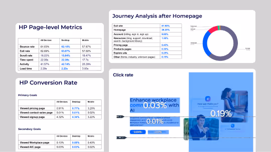
We analyzed user behavior across the homepage using Contentsquare to identify drop-off points, engagement patterns, and baseline performance—highlighting where users were losing context or failing to progress.
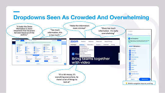
Conducted moderated user testing to understand how users interpreted Zoom’s offering, revealing gaps in product awareness and difficulty forming a clear mental model of the platform.
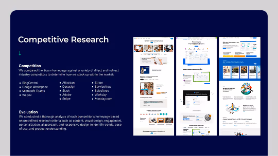
Evaluated how peer companies structured and communicated their platforms, identifying patterns in clarity, positioning, and navigation that exposed gaps in Zoom’s experience.
Interviewed senior leaders across Product, Marketing, Engineering, and Sales to align on business priorities, positioning goals, and future direction.
Across research, user feedback, and stakeholder input, one thing became clear: Zoom had no shortage of content, but it lacked a clear narrative to understand it all.
My team synthesized these inputs into a comprehensive creative brief, defining the problem, opportunity, and strategic direction. The brief served as both a milestone and an alignment tool—bringing together perspectives across Product, Marketing, Engineering, and executive leadership.
Through this process, we established a shared understanding of Zoom’s current state and future direction, aligning on the role the homepage needed to play in bridging that gap. With that foundation in place, we were able to move into execution with clarity and confidence.
Users still primarily associated Zoom with meetings, with little awareness of the 18 other products and features in the catalog.
Zoom’s products were presented as individual tools rather than a connected suite, making it difficult to understand how they worked together.
Users were curious about AI, but skeptical of hype—requiring messaging grounded in clear, tangible benefits.
Shift from feature-based messaging to solution-based storytelling—centering the experience on outcomes, not capabilities. This shift provided a unified way to increase product awareness, connect the platform, and make AI messaging more tangible and credible.
Reframe Zoom around what users can achieve, introducing products as outcomes rather than individual features.
Present products as an integrated suite, showing how they work together across workflows instead of as isolated tools.
Position AI through clear, practical benefits—focusing on what it enables users to do rather than abstract capabilities or hype.
With a clear strategic foundation in place, we moved into exploration—translating our principles into distinct homepage directions.
Rather than converging too early, we developed multiple concepts that each emphasized a different strategic priority. While all directions were grounded in the same core principles, they varied in how they balanced product clarity, solution storytelling, and AI positioning.
This work was distributed across the team, with designers owning individual directions and iterating through regular critiques and stakeholder reviews. The goal was not to find a single answer immediately, but to learn which approaches most effectively communicated Zoom’s platform and resonated best with our diverse group of internal stakeholders.
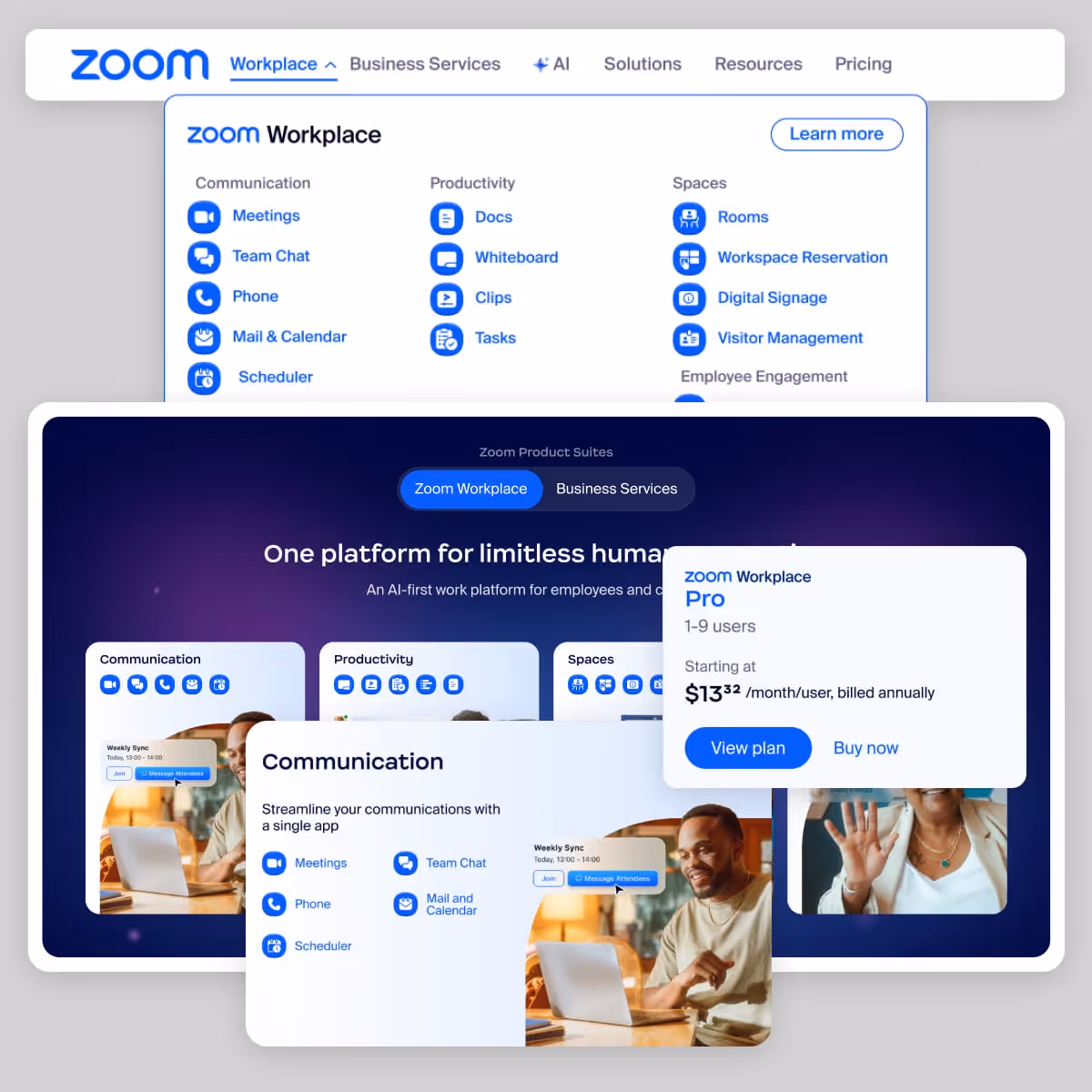
Focused on clarifying the product ecosystem, this direction emphasized how Zoom’s products fit together as a unified platform. Interactive elements, like a system-level “wheel,” helped visualize relationships between products and make the platform easier to understand.
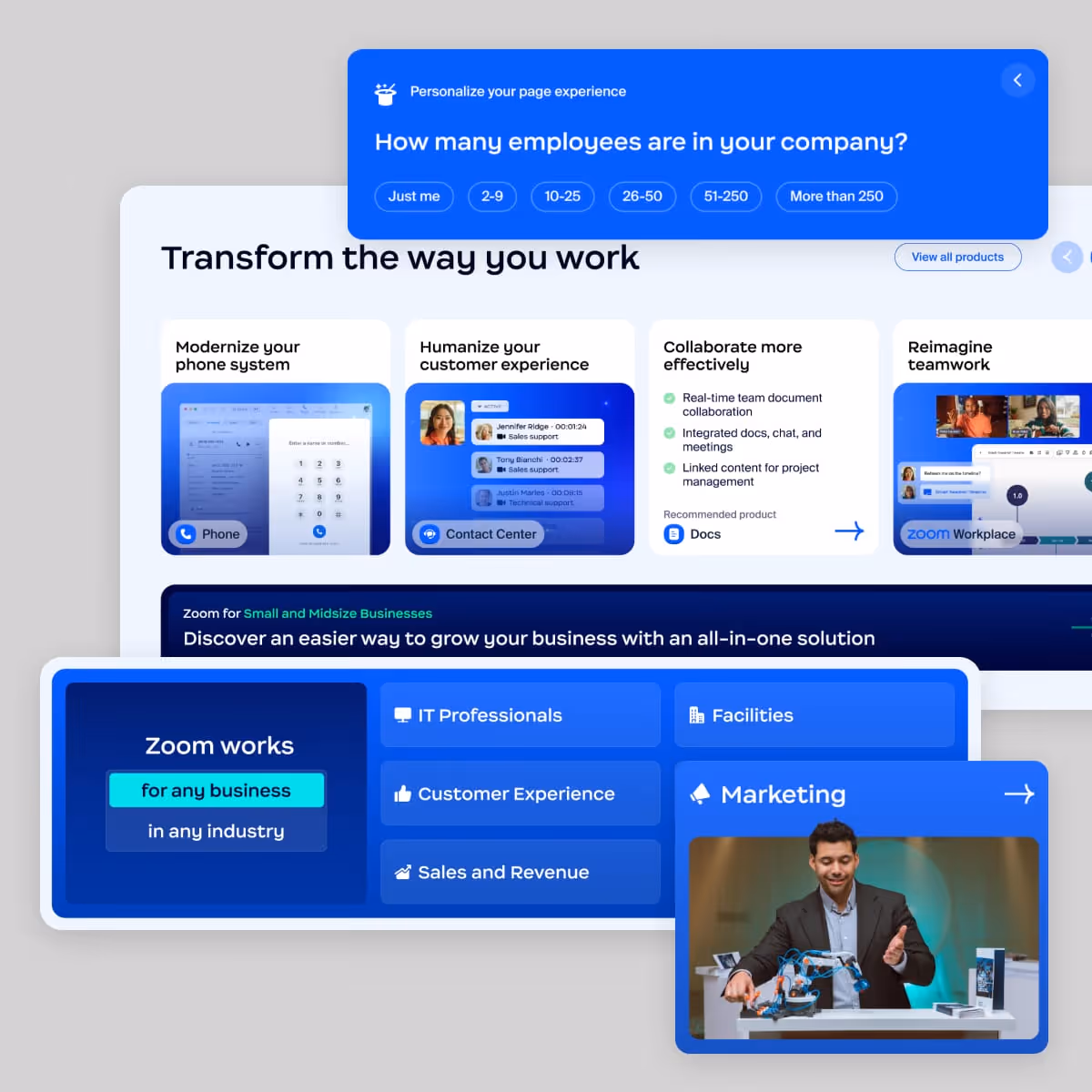
Centered on user outcomes, this direction framed Zoom through the problems it solves—highlighting use cases like collaboration and productivity. It also introduced light personalization, allowing the experience to adapt to different audiences and surface more relevant content.
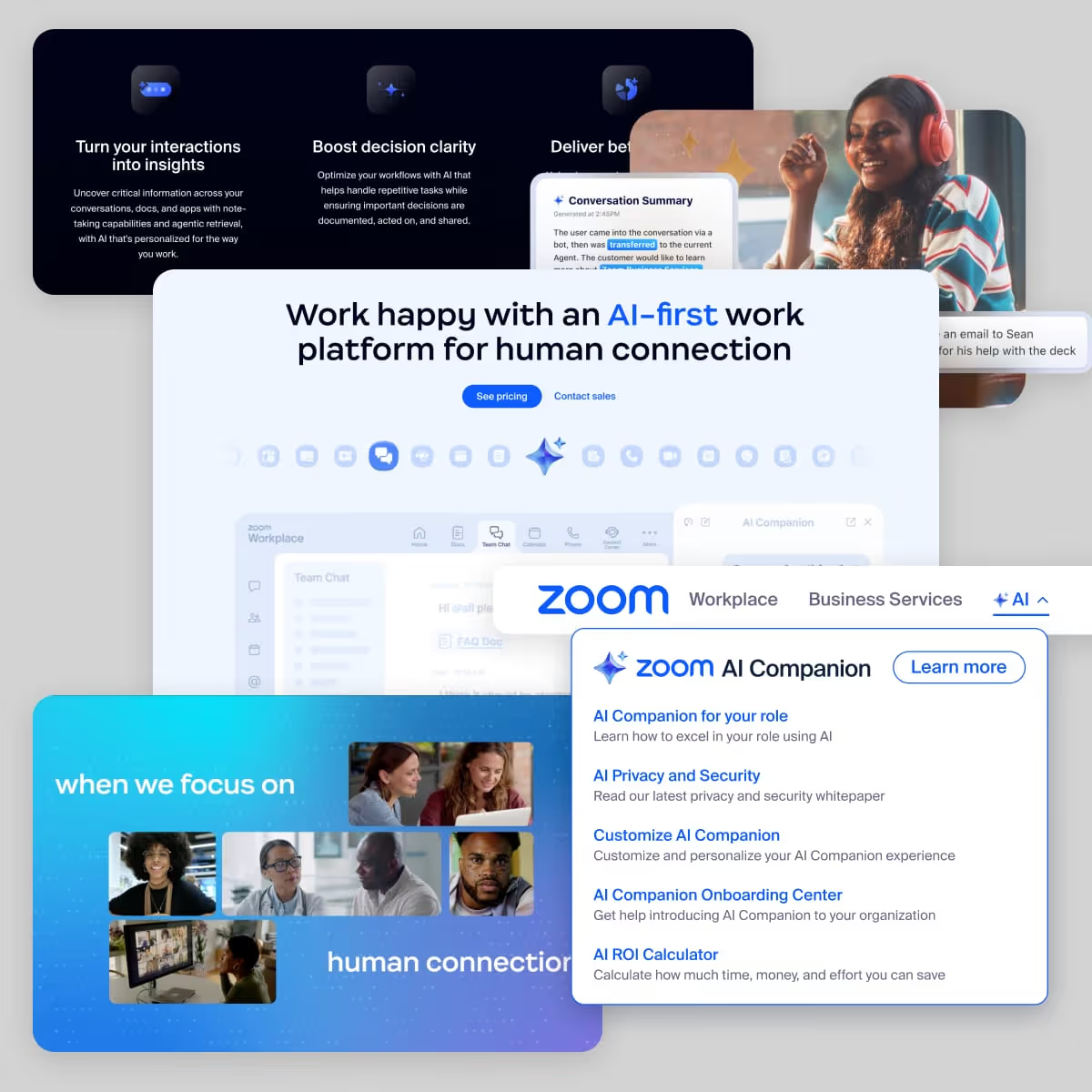
Positioned AI as the foundation of the platform, this direction led with Zoom’s AI capabilities as the primary narrative. It incorporated elements of both platform and solution storytelling, but with a stronger emphasis on AI as the unifying layer across the entire company.
These concepts were instrumental in aligning a diverse group of stakeholders. Each direction was informed by research across teams and calibrated to reflect different priorities—giving us a shared language to evaluate tradeoffs and discuss the future of the platform.
By translating ambiguity into tangible design solutions, we made it significantly easier to align on direction and move forward with confidence.
But just as alignment was coming into focus, the story flipped.
Midway through the project, we were given a company-wide directive to reposition Zoom as an agentic AI platform, with a public announcement planned for Enterprise Connect in March 2025—just 10 weeks away.
This was at the start of the “agentic” wave, and leadership was intent on positioning Zoom at the forefront of it. But beyond the label itself, there was little guidance on how that positioning should be defined or communicated.
Because the website was the most visible expression of the Zoom brand, it became the primary vehicle for articulating this shift. In practice, that meant the homepage wasn’t just supporting the positioning—it was the positioning.
Without an established narrative to work from, it fell to our team to define how this new direction would be communicated to the world—using the website as the primary articulation of Zoom’s evolving position.
What began as a homepage redesign quickly expanded into a full web ecosystem effort. The website, as the primary expression of Zoom’s brand and product positioning needed to reflect this new direction across every major surface.
This included global navigation, the All Products experience, the AI Companion page, and updates across core product and marketing pages. Because our team owned the primary web platform, we were responsible for coordinating this work across multiple properties and partner teams.
We had been on track for another 3 months of work to design, develop, and test the homepage, but that timeline was now compressed into a fixed 10-week window even as the scope expanded significantly.
While the directive introduced significant uncertainty, we had already explored an AI-led concept during earlier phases of the project—knowing AI was a key priority for the business.
Rather than restarting, we were able to build on an existing, research-driven direction, adapting it to align with the new “agentic platform” positioning as it continued to take shape. Just as importantly, the research and strategic foundation we had established remained highly relevant.
It allowed us to ground this new positioning in real user needs—ensuring that even as the narrative shifted, the experience would still resonate. This approach enabled us to move quickly, using the AI-led concept as a flexible framework to integrate platform and solution narratives while the broader company story was still being defined.
With a fixed 10-week timeline and no defined narrative, our standard linear process—content, design, develop, test, launch—was no longer viable.
As the project lead, I was responsible for coordinating work across design, engineering, Product Marketing, content, partner web teams, localization, and testing—each with their own dependencies, inputs, and review cycles.
To make this possible, we broke down and reinvented the very system behind the work—prioritizing parallel execution, rapid decision-making, and continuous validation.
We organized work into small, cross-functional pods—each responsible for a defined set of components or sections. Content, design, and engineering progressed together within each pod, allowing work to move forward independently and in parallel.
This structure reduced bottlenecks, increased ownership, and enabled faster iteration across a broad surface area.
I formed a cross-functional task force of team leads that met daily to align on priorities, resolve blockers, and coordinate across teams.
This created a fast feedback loop between disciplines and ensured that decisions could be made and executed without delay.
Rather than trying to perfect a single solution upfront, we designed for iteration. Modular sections allowed us to test different narratives (AI, product, solutions) with minimal rework, supported by clear metrics to evaluate performance post-launch.
This approach reduced risk and ensured that major decisions could be validated with real data.
With limited time and incomplete information, we prioritized speed of decision-making. We simplified wherever possible—cutting scope, reducing edge cases, and making calls early rather than waiting for perfect clarity.
This allowed the team to maintain momentum and avoid getting blocked by dependencies or unresolved questions.
Lorem ipsum dolor sit amet, consectetur adipiscing elit, sed do eiusmod tempor incididunt ut labore et dolore magna aliqua. Ut enim ad minim veniam, quis nostrud exercitation ullamco laboris nisi ut aliquip ex ea commodo consequat. Duis aute irure dolor in reprehenderit in voluptate velit esse cillum dolore eu fugiat nulla pariatur.
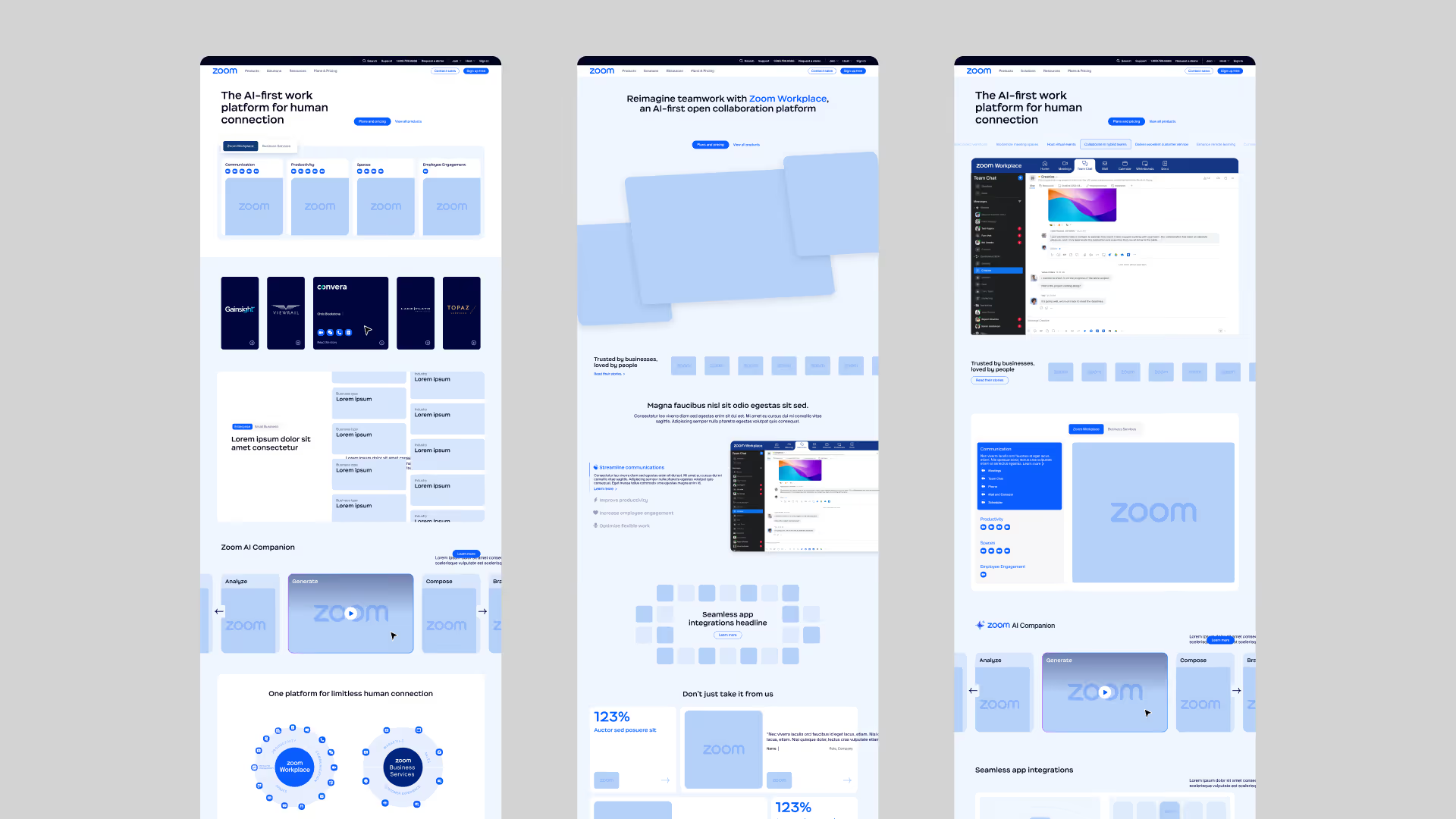
The experience leads with AI as the primary narrative, establishing it in the hero and reinforcing it throughout. Rather than positioning AI as a standalone feature, it is presented as a foundational layer across the platform—setting context for how the rest of the product ecosystem is understood.
AI is introduced through clear, outcome-oriented messaging and supported by examples of how it enhances core workflows. This approach aligns with the company’s direction while keeping the narrative grounded and credible.
Products are organized and presented as a cohesive system, making it clear how they relate and work together. Navigation, grouping, and the All Products experience reinforce these connections—shifting perception from individual tools to an integrated platform.
We focused on clarifying relationships between products, using consistent structure and hierarchy to help users understand how tools fit into broader workflows.
The experience is structured around what users are trying to achieve, connecting use cases to the underlying products. Content is framed through solutions like collaboration and productivity, with light personalization to surface more relevant pathways.
This shift from feature-based to outcome-driven storytelling helps users quickly understand how the platform applies to their needs and navigate into the right products.
In 10 weeks, we launched a cohesive web experience to support Zoom’s shift to an AI-first, agentic platform—despite an evolving narrative, expanding scope, and complex cross-functional dependencies.
Rather than waiting for a fully defined direction, we created the structure that allowed the work to move forward. Through a combination of research, strategic framing, and system design, we aligned teams around a shared approach and built an experience that could absorb change as the positioning continued to evolve.
The result was far more than the initially planned redesign. It established a clear, unified model for how Zoom’s platform is presented—connecting AI, products, and user outcomes into a coherent experience that could scale across the broader web ecosystem.
Research anchors shifting direction
Strong research grounds decisions in real user needs, allowing teams to adapt without losing direction as strategy evolves.
Design drives alignment
Alignment requires a shared language. Clear artifacts turn abstract ideas into common understanding and make decisions possible.
Systems enable scalable design
Impact comes from the systems behind the work. Shared structure and repeatable patterns enable consistency, speed, and long-term scalability.
Adapt processes, not outcomes
Real-world constraints rarely match ideal processes. Effective teams must adjust how they work to fit timelines, ambiguity, and shifting priorities.


